Responsive Design
- Project date: January, 2021
- GitHub repo: www.github.com/andreammgcol
- Learning project: Holberton School
- Country: USA
Learning Objectives
- Mobile-first design
- Media-queries
- Sizes to use for responsive web design
- How to make a website responsive
- Differences between responsive and adaptive design
- CSS units that are used to make elements flexible
Process details
Advanced program project: Holberton school is a peer-learning, project-guided, Full Stack Software Engineering School.
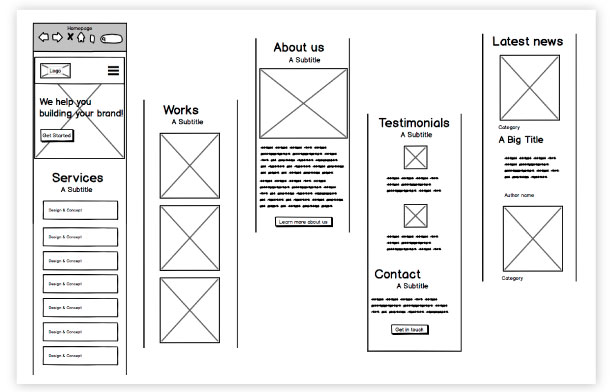
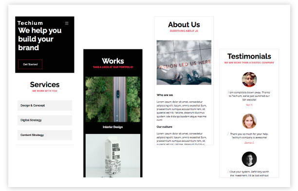
Wireframe - mobile version
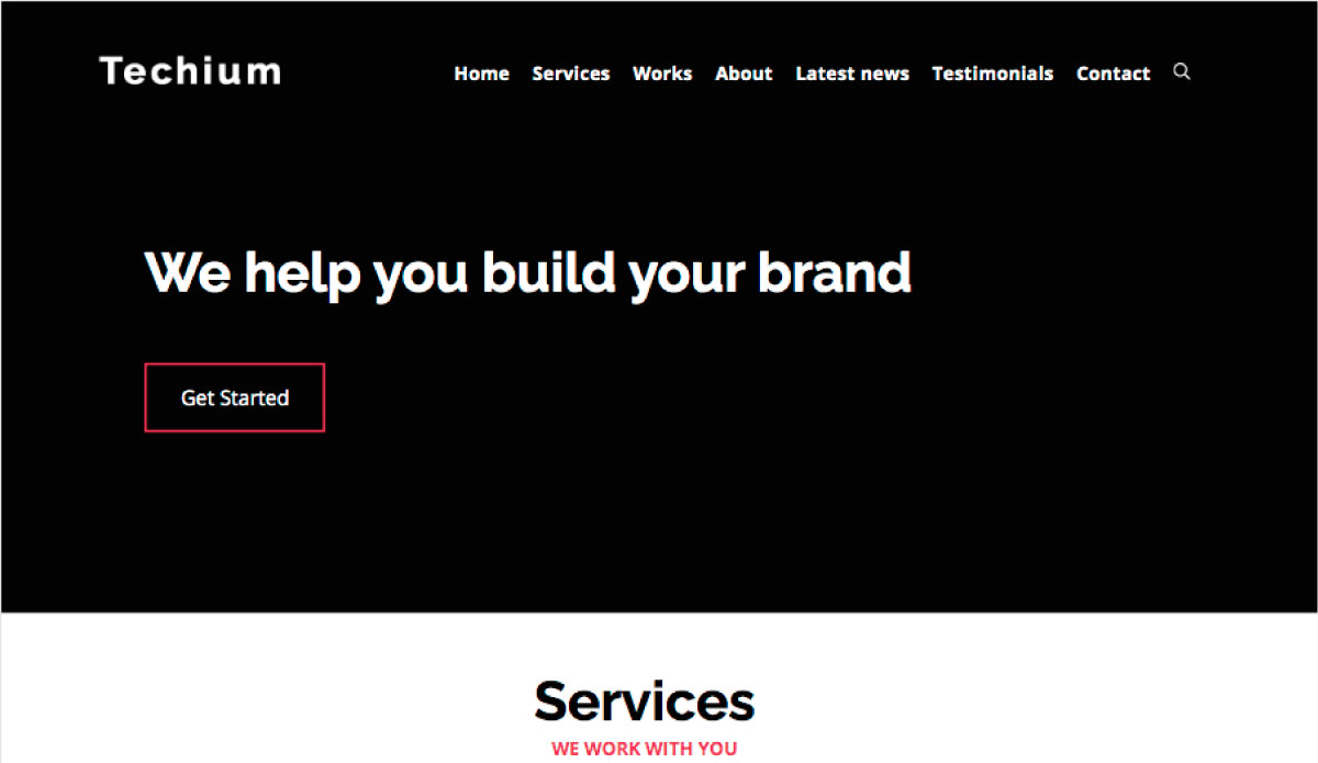
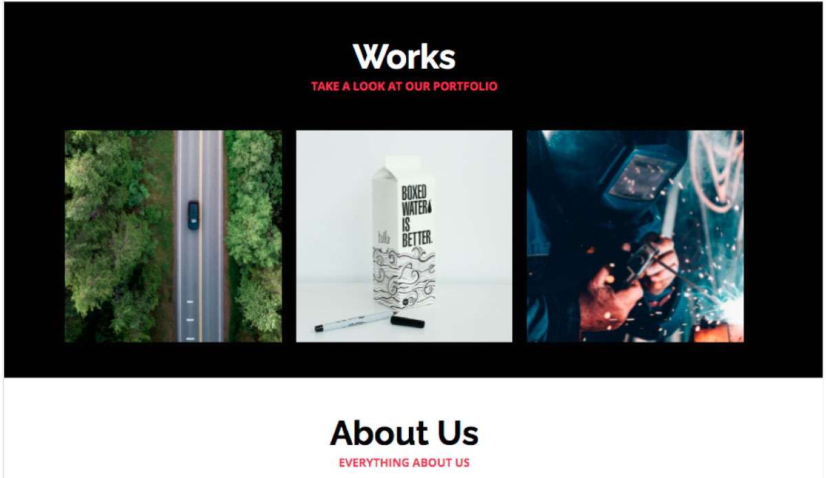
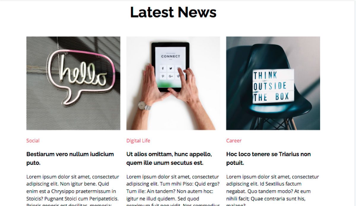
Final Result
Tools & Technologies
Html5, CSS, Media Queries